
LifeSpace Interiors & Decors

How to Blend Traditional Karnataka Aesthetics with Modern Interior Design

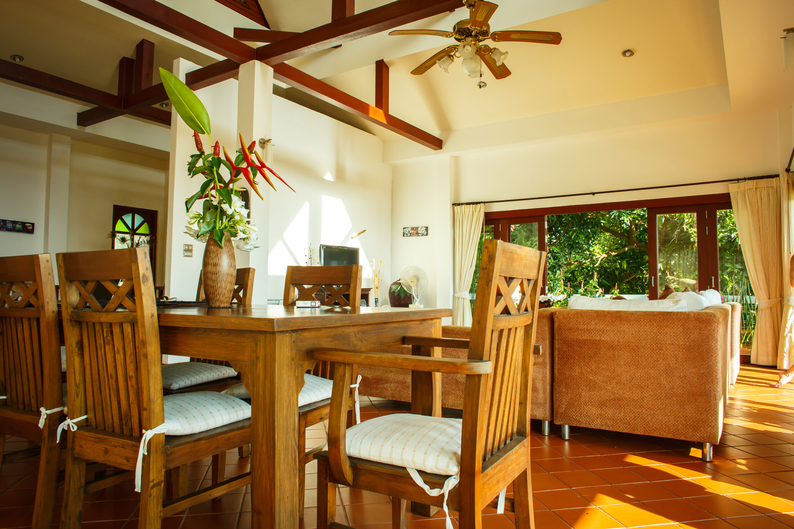
How to Blend Traditional Karnataka Aesthetics with Modern Interior Design Karnataka has one of the richest design traditions in India. The woodwork of Mysuru, the stone craftsmanship of Belur and Halebidu, the handloom textiles of Ilkal and Molakalmuru, the brass and bronze work of Dharwad, the lacquerware of Channapatna, the intricate tile patterns of the coastal Tulu Nadu region, all of it represents a design vocabulary that has been refined over centuries and that carries a depth of craft and cultural identity that no contemporary material or technique can simply replicate. And yet most modern homes in Karnataka, particularly in cities like Bengaluru, Mangalore and Udupi, make no reference to this tradition at all. They look like modern apartments anywhere in India, or anywhere in the world, because the default language of contemporary interior design is global and largely undifferentiated. The case for blending traditional Karnataka aesthetics with modern interior design is not about nostalgia or about recreating historical spaces in contemporary homes. It’s about the fact that design traditions rooted in a specific place, climate and culture carry intelligence that generic contemporary design doesn’t. The proportions of traditional Karnataka architecture, the materials used in coastal Karnataka homes, the craft traditions that have survived because they work, all of these carry functional wisdom alongside their aesthetic identity. A modern interior that draws on this tradition thoughtfully is both more interesting and more suited to its context than one that ignores it entirely. At LifeSpace Interiors & Decors, based in Udupi and working across coastal Karnataka, the dialogue between traditional regional aesthetics and contemporary design thinking is something we bring to residential and commercial projects with genuine understanding of both sides of that conversation. Understanding What Traditional Karnataka Aesthetics Actually Means Before talking about how to blend traditional Karnataka aesthetics into a modern interior, it’s worth being specific about what that tradition actually consists of, because Karnataka’s design heritage is not a single uniform style. It’s a collection of regional traditions that differ significantly between the coastal Tulu Nadu belt, the Mysuru region, the Deccan plateau and the northern districts. Coastal Karnataka, which includes Udupi, Mangalore and the surrounding areas, has a design tradition shaped by the monsoon climate, the availability of local materials, the influence of trade connections with the Middle East and Southeast Asia and the architectural requirements of a region that receives some of the heaviest rainfall in India. Traditional coastal Karnataka homes, known as Tulu Nadu houses or Mangalorean bungalows, are characterised by steeply pitched roofs with deep overhangs to manage the monsoon, open verandahs that allow ventilation while providing rain protection, heavy timber construction using local teak and rosewood, Mangalorean clay roof tiles, and carved wooden screens and panels that filter light and air while maintaining privacy. The Mysuru region has a different but equally distinctive tradition centred around the elaborate woodcarving of the Mysuru royal court, inlaid furniture using rosewood and ivory, silk textiles in the deep jewel tones of Mysore silk and the architectural grandeur of the Hoysala-influenced decorative vocabulary. Channapatna, between Bengaluru and Mysuru, is famous for lacquered wooden toys and objects that use a distinctive bright palette of red, green and yellow on natural wood, a craft tradition that dates back to the Tipu Sultan era. Understanding which strand of Karnataka’s design tradition is being referenced in a contemporary interior matters because the results are very different, and mixing traditions without awareness of their origins produces a generic Indianness rather than a specific Karnataka identity. Timber as the Foundation of a Karnataka-Inflected Interior Wood is the most fundamental material in Karnataka’s design tradition, and it’s the most direct way to bring a regional aesthetic sensibility into a contemporary interior without resorting to pastiche. Traditional coastal Karnataka homes used teak and rosewood extensively for structural columns, carved screens, door frames, ceiling panels and furniture. The warmth, depth and craftsmanship visible in the woodwork of an old Tulu Nadu house is one of the defining qualities of the regional aesthetic. In a contemporary interior, timber can carry this tradition without the decorative vocabulary of the historical architecture. The material itself, its warmth, its grain, its relationship to light, does a significant amount of work without needing to be carved or ornamented in a traditional style. A floor in solid teak, a ceiling with exposed timber beams, a kitchen with a rosewood veneer finish on the cabinet doors, a living room with a feature wall in reclaimed wood, all of these reference the material tradition of Karnataka interiors without reproducing the historical style literally. The specific species of wood matter here. Teak is the most historically significant timber in coastal Karnataka architecture and the one that carries the most direct reference to the regional tradition. Rosewood is equally significant in the Mysuru tradition. Using these timbers in contemporary applications acknowledges the regional material heritage in a way that generic plywood or MDF with a wood-look laminate cannot. At LifeSpace Interiors & Decors, timber specification across our projects is made with full awareness of the regional material tradition and with relationships to quality suppliers that allow us to source the right materials for projects where that heritage matters. Explore our furniture and decor projects to see how timber is used across our residential and commercial work. Bringing in Craft Without Creating a Museum The craft traditions of Karnataka are rich enough to fill an interior with genuine character without the space tipping into a museum of regional artefacts. The key is selectivity and placement. One or two pieces of exceptional craft in a contemporary interior carry more weight and read with more integrity than a collection of craft objects distributed throughout the space without editorial consideration. A single piece of Channapatna lacquerware, well-chosen and placed on a surface where it can be seen clearly, tells a more coherent design story than a dozen smaller pieces scattered across multiple rooms. A handwoven Ilkal or Molakalmuru textile used as a throw or a cushion cover in a

Read more

How to Create a Relaxing Bedroom Retreat in a Busy Indian Home

The Indian home is rarely quiet. Between family members, domestic routines, the sounds of a busy neighbourhood and the general energy of a household that’s actively lived in, finding genuine stillness within the home is something most people have stopped expecting. The bedroom is supposed to be the exception. It’s the one room in the house that exists primarily for rest, and yet in most Indian homes it’s the room most likely to double as a home office, a television room, a children’s play area and a general overflow space for everything that doesn’t have a permanent home elsewhere. The result is a bedroom that functions adequately as a sleeping space but doesn’t function at all as a retreat. You go to bed but you don’t decompress. You’re in the room but your mind is still running because the environment around you is doing nothing to signal that it’s time to slow down. This is a design problem, not a willpower problem, and it has design solutions. Creating a bedroom retreat in a busy Indian home doesn’t require a complete renovation or an unlimited budget. It requires understanding what makes a space genuinely restorative and making deliberate decisions in that direction at every level of the room, from the sensory environment through to the material choices, the lighting, the storage and the small details that either support rest or undermine it. At LifeSpace Interiors & Decors, bedroom design is one of the areas where considered design thinking makes the most immediate and personal difference to daily life, because the quality of rest a bedroom supports directly affects the quality of everything that happens outside it. The First Decision: What Stays Out of the Bedroom Before thinking about what goes into a bedroom retreat, it’s worth being honest about what currently lives in the bedroom that shouldn’t. The television is the most common intrusion. The home office setup is the second. The pile of clothes that didn’t make it into the wardrobe, the exercise equipment that seemed like a good idea when it was bought, the children’s toys that migrated in and never migrated out, the stack of books and papers that accumulates on every available surface. All of it contributes to an environment that feels busy rather than restful. A retreat is defined partly by what it excludes. A bedroom that contains work equipment, entertainment technology, children’s belongings and household overflow is not a retreat by any reasonable definition, regardless of how well it’s decorated. The first design decision for a bedroom retreat is therefore a curation decision: what is genuinely appropriate for a room whose primary purpose is rest, and what needs to find a home elsewhere in the house. This is not about achieving a minimalist aesthetic for its own sake. It’s about creating a room where the visual and functional signals are consistently aligned with rest and restoration rather than with productivity, entertainment or storage. A room that feels calm is a room where every element supports that calm rather than competing with it. Colour That Works With the Brain, Not Against It The colours in a bedroom have a direct effect on the nervous system, and in a room designed for rest, this effect needs to be working in the right direction. High-saturation colours, very bright whites, strong contrasts and visually complex patterns all create a level of stimulation that is genuinely counterproductive in a space intended to support sleep and relaxation. The colours that consistently support a restful environment are soft, muted and warm. Dusty sage green, warm grey, soft terracotta, pale dusty blue, warm ivory and muted blush all create an atmosphere of calm that helps the nervous system down-regulate in the way it needs to before sleep. These aren’t the most exciting colours in the world, which is exactly the point. The bedroom is not the room for visual excitement. Warm undertones in a bedroom colour palette are more conducive to rest than cool ones. A grey with warm undertones, a greige or a warm taupe, feels more enveloping and comfortable than a cool blue-grey, particularly in the evening under artificial light. Indian skin tones are also flattered more by warm light and warm wall tones, which makes the bedroom feel more personally welcoming in addition to more restful. The ceiling is an often-overlooked surface in bedroom colour planning. Most bedrooms have white ceilings regardless of the wall colour, which creates a contrast that keeps the eye alert. A ceiling in a slightly lighter tone of the wall colour, or in a warm white rather than a cool white, creates a sense of enclosure and warmth that makes the room feel more cocoon-like. This is the quality that makes certain hotel rooms feel immediately restful in a way that’s difficult to articulate but is immediately felt. At LifeSpace Interiors & Decors, colour consultation for bedroom projects uses 3D visualization to show clients exactly how their chosen palette will look under different lighting conditions before any paint is applied or materials are ordered. Explore our design visualization services to understand how this process eliminates colour regret before it has a chance to occur. Lighting That Transitions Between Day and Night Lighting in a bedroom retreat needs to do something that lighting in most other rooms doesn’t: it needs to actively support the transition from alertness to rest. This is a physiological requirement, not just an aesthetic one. Bright, cool-toned light suppresses melatonin production and signals to the brain that it’s time to be awake and alert. Warm, dim light does the opposite, creating the conditions the brain needs to begin winding down. A bedroom retreat needs lighting that can shift between these two states easily and without requiring complex adjustments. The baseline is layered lighting with dimmer control. A warm-toned ambient light on a dimmer for general use during the day, warm bedside lamps for the hour before sleep, and complete darkness or very low ambient light for sleeping covers the full range

Read more

What Is a Turnkey Interior Project and Why Most Homeowners Prefer It

At some point during the planning of a home interior, most homeowners arrive at the same realisation. The number of decisions involved, the number of vendors to coordinate, the number of things that can go wrong between a design on paper and a finished room, is significantly larger than they anticipated when they started. They imagined choosing colours, selecting furniture and watching a beautiful home take shape. What they find instead is a complex coordination exercise involving architects, contractors, carpenters, electricians, plumbers, tile layers, painters and furniture suppliers, each of whom works on their own schedule, quotes separately, communicates differently and has no particular interest in how their work connects to what everyone else is doing. This is the problem that turnkey interior projects solve. And it’s why, once a homeowner understands what a turnkey project actually means and what it includes, most of them prefer it to the alternative. At LifeSpace Interiors & Decors, turnkey execution is one of our most requested services and the one that consistently receives the strongest feedback from clients once the project is complete. Understanding why requires understanding what the alternative looks like in practice. What Turnkey Actually Means The word turnkey comes from the idea of handing a client a key to a completed space. You turn the key, walk in and everything is done. No follow-up visits from contractors, no punch list of items still to be finished, no waiting for a final piece of furniture to arrive. The space is complete, functional and ready to live in from the moment it’s handed over. In the context of interior design, a turnkey project means a single firm takes responsibility for the entire scope of work from the initial design concept through to the final styling and handover. This includes architectural drawings, construction and civil work, interior design, all trades including electrical and plumbing, joinery and furniture, flooring, wall treatments, lighting installation, decor and accessories, and the coordination of every vendor and contractor involved in delivering all of the above. The client has one point of contact throughout. One contract. One firm accountable for the outcome. Everything else, the scheduling, the vendor management, the site supervision, the quality checks and the problem-solving when things don’t go to plan, is handled by the turnkey provider. This is fundamentally different from the more common alternative, where the homeowner manages the project themselves, hiring an architect or designer for the concept, a contractor for the construction, a carpenter for the joinery, separate vendors for flooring, tiles, electrical work and furniture, and then attempting to coordinate all of these parties toward a coherent outcome on a shared timeline. What the Self-Managed Alternative Actually Looks Like To understand why turnkey projects are preferred by most homeowners who have experienced both approaches, it helps to be honest about what self-managed projects typically involve. The homeowner begins with a designer or architect who produces a concept and a set of drawings. They then take those drawings to a contractor for a quote on the civil and construction work. The contractor quotes on the structure but not the finishes. The finishes require a separate visit to a tile showroom, a flooring supplier and a paint dealer. The carpenter quotes separately on the joinery based on drawings that may or may not match exactly what the contractor is building. The electrician has a view on where the points should go that doesn’t always align with where the designer wants the lights. The plumber needs access to the bathroom when the tile layer has already started work. Each of these parties communicates primarily with the homeowner rather than with each other. When the carpenter’s measurements don’t align with what the contractor has built, the homeowner finds out when the carpenter arrives on site and discovers the discrepancy. When the electrical points aren’t where the lighting designer expected them, the homeowner is the one who has to resolve it. When a tile that was specified is out of stock and needs to be substituted, the homeowner has to make that decision, often under time pressure and without the full context of how the substitution will affect the rest of the design. This coordination burden falls entirely on the homeowner in a self-managed project, and it is relentless. It requires availability, decision-making capacity, design knowledge, vendor management skills and the ability to resolve conflicts between parties who each have their own priorities. Most homeowners have none of these as dedicated resources because they have full-time jobs, families and lives that don’t pause for a home renovation. Why Single-Point Accountability Changes Everything The most significant advantage of a turnkey project is not the convenience, although that is real and substantial. It is accountability. When a single firm is responsible for the entire scope of a project, there is no ambiguity about who is responsible when something goes wrong. There is no contractor blaming the carpenter, no carpenter blaming the electrician, no designer pointing to the contractor as the reason the finished result doesn’t match the concept. In a self-managed project, this accountability gap is where most of the significant problems hide. When the tile layer’s work doesn’t align with what the designer specified, the designer says the contractor should have supervised more carefully. The contractor says the tile supplier provided the wrong material. The tile supplier says the specification was unclear. The homeowner is left in the middle of a dispute between parties who each have a financial interest in not being held responsible, with no clear mechanism for resolving it. In a turnkey project, none of this happens because the turnkey provider is accountable for all of it. If the tile doesn’t match the specification, the turnkey provider replaces it. If the carpenter’s work doesn’t align with the contractor’s construction, the turnkey provider resolves it internally. The homeowner doesn’t enter the dispute at all. At LifeSpace Interiors & Decors, turnkey accountability is not a marketing claim. It is a structural feature of how the

Read more

How to Design a Guest Bedroom That Makes Visitors Feel at Home

How to Design a Guest Bedroom That Makes Visitors Feel at Home There is a particular feeling that comes from staying in a guest bedroom that has been genuinely thought about. The bed is comfortable, the lighting is right, there is somewhere to put your things, the room is neither too warm nor too cold and everything you might need is within reach without having to ask. It is the feeling of being a welcome guest rather than an inconvenient one. Most guest bedrooms in Indian homes do not create this feeling, not because the hosts don’t care, but because the guest bedroom is typically the last room in the house to receive design attention and the first to be repurposed as storage when space is needed. A well-designed guest bedroom is one of the most generous things a home can offer. It communicates to the people who matter enough to stay with you that their comfort was considered before they arrived. And unlike the rooms that get the most design attention, the living room, the master bedroom, the kitchen, the guest bedroom has a specific and relatively contained set of requirements that make it genuinely achievable without an enormous budget or a complex brief. At LifeSpace Interiors & Decors, guest bedroom projects are approached with the same rigour as every other room in the home, because a room that’s used occasionally deserves to be done properly rather than treated as an afterthought. Start With the Bed: Everything Else Follows The bed is the single most important element in a guest bedroom and the one that most directly determines whether a guest sleeps well or spends the night wishing they had booked a hotel instead. A guest who sleeps badly in your home will remember it, even if they’re too polite to say so, and it will affect whether they look forward to visiting again. The mattress quality matters more than the bed frame in determining sleep quality, but both need to be considered. A quality mattress in a guest bedroom is not a luxury. It is the minimum requirement for a room that’s asking someone to sleep in it. A mattress that’s too soft, too firm, too old or too thin communicates that the guest’s comfort was not a priority regardless of how well everything else in the room is designed. The bed size should be generous relative to the room dimensions. A single bed in a guest room that could accommodate a double sends a clear message about the priority given to guest comfort. A queen size bed in a guest bedroom that has the space for it is the most universally comfortable option for single guests and couples alike. Bedding quality is where the guest experience is most immediately felt. Hotel-quality cotton with a thread count of 300 or above feels genuinely different from standard bedding, and guests notice the difference within the first few minutes of getting into bed. White or near-white bedding reads as clean and considered regardless of the room’s colour palette and is easy to launder and maintain in a presentable condition. At LifeSpace Interiors & Decors, bedroom projects begin with a precise 3D visualization that shows exactly how the bed, storage and other elements will sit in the space before any furniture is ordered or installed. Explore our design visualization services to see how this process ensures the room works properly before anything is committed to. Storage That Respects the Guest’s Need for Space One of the most common failures in guest bedrooms is the absence of usable storage. A guest arriving for a few days with a suitcase needs somewhere to hang clothes, somewhere to put folded items and somewhere to place the personal effects that accumulate over the course of a stay. A room with no wardrobe, no hooks and no surface space beyond the bed forces guests to live out of their suitcase for the duration of their visit, which is uncomfortable regardless of how beautiful the room looks. A dedicated wardrobe with hanging space and a shelf section is the minimum storage requirement for a guest bedroom that will be used for stays of more than one night. The wardrobe doesn’t need to be large, but it needs to be genuinely available to the guest, which means it shouldn’t be used to store the household’s overflow belongings when guests aren’t in residence. A luggage rack or a low bench at the foot of the bed gives guests somewhere to place their bag that isn’t the floor. This is a detail that most people don’t think about until they’re a guest somewhere that doesn’t have one, at which point its absence becomes a daily minor frustration. A luggage rack costs very little and communicates genuine consideration for the guest experience. Drawer space within the wardrobe or in a bedside table gives guests somewhere to put smaller personal items without having to leave them on surfaces where they create visual clutter. A guest bedroom that offers genuine storage options allows guests to settle into the space rather than camp in it. Custom wooden storage built to the exact dimensions of the guest bedroom is particularly effective in rooms where the available floor space is limited, because it uses every centimetre of wall space efficiently and can incorporate the specific combination of hanging, shelving and drawer storage that the room needs. Read more about how custom furniture transforms a room’s functionality and why it consistently outperforms ready-made alternatives in rooms where space is at a premium. Lighting That Works for Multiple Purposes Guest bedrooms are used for sleeping, reading, getting dressed and occasionally working, and the lighting needs to support all of these activities without requiring the guest to navigate an unfamiliar lighting system in the dark. The most common lighting failure in guest bedrooms is relying on a single overhead light that’s either on or off. This creates harsh, unflattering light when it’s on and complete darkness when it’s off, with no middle ground for the ambient, low-level

Read more

Open Kitchen vs Closed Kitchen: Which Works Better for Indian Homes

Few decisions in a home renovation generate as much debate as the kitchen layout question. Open plan or closed? Connected to the living area or separated behind a wall? It’s a conversation that comes up on almost every residential project we handle at LifeSpace Interiors & Decors, and the honest answer is that neither option is universally better. The right choice depends on how a specific household cooks, lives and uses its home, and getting it wrong is an expensive mistake to correct once the walls are up or down. What makes this question particularly interesting in the Indian context is that the way Indian families cook is genuinely different from the Western households that popularised the open plan kitchen concept. Indian cooking involves high heat, significant oil, strong spices and the kind of smoke and steam that an extractor hood in a European kitchen never has to contend with at the same scale. That reality shapes the open versus closed question in ways that a straightforward aesthetic preference for one style or the other doesn’t account for. This guide covers both options honestly, the real advantages and the real limitations of each, and the questions every homeowner should answer before making a decision that affects how the home functions every single day. What an Open Kitchen Actually Means An open kitchen is one where the cooking area shares a visual and physical connection with the living or dining area, with no full wall separating them. This might mean a completely open floor plan where kitchen, dining and living areas flow into one another, or a semi-open arrangement where a counter or breakfast bar creates a partial separation without a full wall. The open kitchen became the dominant layout in aspirational Indian home design over the last decade, driven largely by the visual appeal of the concept in international interiors media and by the fact that new apartment developments increasingly offer open plan layouts as a premium feature. The look is undeniably appealing. A well-designed open kitchen connected to a spacious living and dining area feels generous, modern and social in a way that a kitchen behind a closed door cannot. What a Closed Kitchen Actually Means A closed kitchen is a dedicated room with walls and a door that separates the cooking area from the rest of the home. It’s the traditional configuration in Indian homes for good historical reason, and it remains the majority layout in older apartments and houses across the country. The closed kitchen is often described as old-fashioned in the context of contemporary interior design, which is unfair. It’s a layout that solves specific problems very effectively, and those problems are particularly relevant to how most Indian households actually cook on a daily basis. The Case for Open Kitchens in Indian Homes The open kitchen offers genuine advantages that are worth taking seriously before dismissing it as impractical for Indian cooking habits. Social connection is the most significant. In a home where the person cooking is isolated behind a wall while the rest of the family or guests are in the living area, the cook spends a meaningful portion of their time at home cut off from the social life of the household. An open kitchen removes that isolation entirely. Cooking and conversation happen in the same space. Children doing homework at the dining table are visible to the parent preparing dinner. Guests can interact with the host without everyone crowding into the kitchen. Visual spaciousness is the second major advantage. Removing a wall between the kitchen and the living or dining area makes both spaces feel larger because the eye can travel further without interruption. In apartments where individual rooms are modest in size, opening the kitchen into the living area can transform the perceived scale of the entire floor plan. Natural light improves significantly in an open kitchen because light from windows in the living area reaches the cooking space and vice versa. Closed kitchens in Indian apartments are often poorly lit by natural light because they’re positioned away from the main facade of the building. Opening the kitchen to the living area gives it access to light sources it wouldn’t otherwise have. At LifeSpace Interiors & Decors, open kitchen projects are designed with a 3D visualization that shows exactly how the space will feel with the kitchen open to the living and dining areas before any demolition or construction begins. Explore our design visualization services to understand how this planning process works in practice. The Real Challenges of Open Kitchens in Indian Homes The limitations of open kitchens in the Indian context are real and need to be considered honestly rather than dismissed as matters that good design can always overcome. Cooking smells are the most frequently cited concern and the most legitimate one. Indian cooking at its most aromatic, a tadka of mustard seeds and curry leaves in hot oil, fish being pan-fried, a slow-cooked curry at high heat, generates smells that are wonderful in the moment and persistent in soft furnishings, upholstery and curtains over time. In a closed kitchen with the door shut, these smells stay contained. In an open kitchen connected to the living area, they spread throughout the home and settle into every fabric surface. A powerful island extractor or ceiling-mounted hood directly above the cooking area manages a significant portion of this, but it doesn’t eliminate it entirely. Anyone who tells you that a good extractor makes an open kitchen equivalent to a closed one for Indian cooking has either never cooked a proper Indian meal in an open plan kitchen or has become accustomed to the smell permeating their living space. Oil and grease distribution is a related problem. The fine oil particles that become airborne during Indian cooking settle on surfaces throughout an open plan space over time. In a closed kitchen, this is confined to the kitchen surfaces. In an open plan, it reaches sofas, curtains, cushions and the surfaces of whatever

Read more

Kids Room Interior Design: How to Build a Space That Grows With Them

A kids room is one of the most emotionally invested spaces in any home and, paradoxically, one of the most frequently redesigned. Parents put real thought and real money into creating a room that feels magical and perfectly suited to their child, only to find that three years later the theme is outgrown, the furniture no longer fits and the whole thing needs to be redone. It’s a cycle that’s almost entirely avoidable when the room is designed with growth in mind from the beginning rather than optimised for the child as they are right now. The challenge with kids room design is that it requires holding two things in mind simultaneously. The room needs to feel genuinely suited to the child who will live in it today, warm, stimulating, personal and fun. And it needs to be flexible enough to evolve with that child through stages that will change what they need from the space significantly. A room that works for a five-year-old, an eleven-year-old and a fifteen-year-old doesn’t happen by accident. It’s the result of decisions made at the design stage that prioritise adaptability alongside immediate appeal. At LifeSpace Interiors & Decors, kids room projects are approached with this dual requirement at the centre of every decision, because a room that needs to be redesigned every few years is neither good design nor good value for the family living with it. Start With the Structure, Not the Theme The most common mistake in kids room design is starting with the theme. A jungle theme, a princess room, a space exploration concept. These are appealing because they’re immediately vivid and children respond to them with genuine excitement. The problem is that themes are deeply tied to a specific phase of childhood, and when that phase passes, which it will, the theme becomes an embarrassment rather than an asset. The more effective approach is to start with the structural and material decisions that will form the permanent layer of the room, the flooring, the wall treatment, the storage system and the bed configuration, and keep those decisions neutral and adaptable. The theme, if there is one, lives in the layer of decor, textiles and accessories that can be changed without touching the structure. A room with warm white walls, quality timber flooring, a well-designed storage system and a solid bed frame can be a jungle room at five, a football room at nine and a clean, minimal teenage room at fourteen simply by changing the bedding, the artwork, the cushions and the accessories. The structure doesn’t change. Only the surface layer does, and that layer is inexpensive and easy to update. This approach requires more restraint at the design stage than most parents find comfortable, because it means not committing fully to the theme. But the payoff over the ten to fifteen years the room will be used in different configurations is significant. At LifeSpace Interiors & Decors, every kids room begins with a 3D visualization that shows parents exactly how the neutral structure will look and how the theme layer sits over it. Explore our design visualization services to see how this process works before any materials are specified or furniture is ordered. Design the Storage System for the Next Ten Years Storage is where kids room design most consistently fails. Parents either underestimate how much storage a child needs, how rapidly that need grows and how dramatically the type of storage required changes as the child ages, or they specify storage that works perfectly for a toddler and becomes completely inadequate by primary school age. A toddler needs low, accessible storage for toys, books and soft items. A primary school child needs storage for school books, stationery, craft supplies, sports equipment and an expanding collection of everything. A teenager needs desk storage, wardrobe space for clothing that has grown significantly in volume, and somewhere to keep the technology and accessories that become central to daily life. The storage system that handles all of these stages is built-in, floor-to-ceiling and adjustable. A full-height shelving and cabinet system with a combination of open shelves, closed cabinet sections and adjustable shelf heights can be reconfigured as the child’s needs change without replacing the structure. The open shelves that hold toy baskets at five hold books and trophies at eleven and hold a speaker, a lamp and carefully chosen objects at fifteen. The closed cabinet sections hold changing contents without the room looking cluttered at any stage. Custom wooden storage built to the exact dimensions of the room is significantly more effective than modular ready-made systems in a kids room because it uses every centimetre of available wall space and can be designed around the specific layout of the room including windows, doors and architectural features that ready-made systems can’t accommodate. Read more about how custom wooden furniture is designed and built and why it consistently outperforms ready-made alternatives over a long timeframe. The Bed Configuration That Evolves The bed is the largest piece of furniture in a kids room and the one that most visibly signals the age and stage of the child who sleeps in it. A toddler bed is low, compact and surrounded by safety considerations. A child’s bed needs to accommodate growing limbs. A teenager’s bed is essentially an adult bed with the same size and height requirements. Rather than buying a series of different beds as the child grows, a single quality bed frame in a neutral material, a solid timber or a quality upholstered frame in a tone that works with the overall room palette, bought at a size the child will grow into, is the more sensible investment. A full-sized single or a small double, depending on the room dimensions, serves from mid-childhood through to adulthood and can be dressed differently with bedding to suit each stage. Bunk beds and loft beds are worth considering for rooms where floor space is limited, particularly in homes with two children sharing. A loft bed raises the

Read more

Small Bathroom, Big Impact: Design Ideas That Make Every Inch Count

The small bathroom is one of the most common design challenges in Indian homes, and one of the most consistently underestimated. Most homeowners treat it as a problem to be managed rather than a space to be designed, which is exactly why so many small bathrooms feel cramped, dark and frustrating to use despite having had money spent on them. The truth is that a small bathroom handled well can feel significantly more spacious, more functional and more considered than a large bathroom that hasn’t been thought through. The difference is almost entirely in the decisions, not the dimensions. A bathroom that’s four feet by six feet presents real constraints. There’s no point pretending otherwise. But those constraints also force a clarity of thinking that larger spaces don’t require. Every element has to earn its place. Every decision has to serve more than one purpose. And every centimetre of wall, floor and ceiling is a design opportunity rather than dead space. At LifeSpace Interiors & Decors, small bathroom design is something we approach with particular care, because getting it right requires more precision, more creativity and more considered material selection than a larger bathroom with room to spare. Start With the Layout Before Anything Else In a small bathroom, the layout is everything. The position of the toilet, the basin and the shower or bath determines how the space feels to move through, how much usable floor area remains and whether the room feels like it was designed or like the fixtures were placed wherever they happened to fit. The most common layout mistake in small Indian bathrooms is placing fixtures without considering the clearance space around them. A toilet needs a minimum of 450mm of clear space on each side to be comfortable to use. A basin needs enough clearance in front for a person to stand and use it without feeling hemmed in. A shower needs a minimum internal dimension of 800mm by 800mm to be functional. When these clearances are not planned for, the bathroom feels cramped regardless of how good the materials are. In a genuinely small bathroom, the wall-hung toilet is one of the most valuable layout decisions available. Moving the toilet off the floor and mounting it on the wall creates visible floor space beneath it that makes the room feel larger immediately. It also makes cleaning easier, which matters in a high-use space. The cistern is concealed within the wall cavity, which removes the visual bulk of a standard close-coupled toilet and frees up the wall area above for storage or a feature finish. Corner basins and corner showers make use of the least functional areas of a small bathroom and open up the central floor area. A corner basin mounted at the junction of two walls takes up significantly less visual space than a full-width vanity unit and leaves the floor open in a way that reads as spacious rather than tight. At LifeSpace Interiors & Decors, every bathroom layout begins with a precise 2D floor plan and 3D visualization that shows exactly how fixtures will sit in the space, how clearances will work and how the room will feel to move through before a single tile is laid or a fixture is ordered. Explore our design visualization services to see how this process works in practice. Use Large Format Tiles to Create the Illusion of Space Tile choice has a greater impact on how large a small bathroom feels than almost any other single decision. The most counterintuitive principle in small bathroom tiling is that larger tiles make a small space feel bigger, not smaller. This is because fewer grout lines mean fewer visual interruptions across the surface of the room. The eye reads a surface with minimal grout lines as continuous and therefore larger than it actually is. A floor covered in small mosaic tiles has dozens of grout lines per square metre. A floor covered in 600mm by 600mm or 800mm by 800mm tiles has a fraction of that, and the difference in how spacious the room feels is significant. Large format tiles also have a practical advantage in a small bathroom. Fewer grout lines mean less grout to clean and less opportunity for mould and moisture to accumulate. In a bathroom that’s used multiple times daily, this maintenance advantage compounds over years. The direction in which tiles are laid also affects perceived space. Running tiles diagonally across a small floor makes the room feel wider than laying them parallel to the walls. Running floor tiles continuously into the shower area without a change in tile or direction creates a seamless visual flow that extends the perceived length of the room. Keep the Colour Palette Tight and Consistent Colour is one of the most powerful tools available in a small bathroom and one of the most frequently misused. The instinct to use very pale colours throughout to maximise light is understandable but incomplete. A bathroom done entirely in pale colours can feel clinical and flat rather than spacious and calm. The more effective approach is a tight, consistent palette where the floor, walls and major surfaces share a tonal relationship rather than being identical. A bathroom where the floor is a slightly deeper tone of the same colour as the walls, with fixtures and fittings in a consistent finish, reads as a considered composition. The eye moves through the space without being interrupted by strong contrasts, which creates a sense of visual continuity that makes the room feel larger. Deep colours work in small bathrooms when they’re used consistently and paired with quality lighting. A small bathroom done entirely in a deep slate grey or a rich forest green, with warm lighting, quality fixtures and considered material choices, can feel sophisticated and intentional rather than dark and oppressive. The key is commitment. A small bathroom with one dark wall and three pale walls looks unresolved. A small bathroom where the dark colour is used consistently and deliberately looks

Read more

5 Premium Finishing Touches That Separate Good Interiors from Great Ones

There’s a version of every interior project that looks finished and a version that looks exceptional. The difference between them is rarely the big decisions. It’s not the layout, the furniture selection or even the colour palette. By the time a project reaches the final stage, those decisions have already been made and their impact is largely set. What separates a good interior from a great one is what happens in the last ten percent of the project, the finishing touches that most people don’t think about until they’re standing in the completed space wondering why it doesn’t quite feel the way they imagined it would. Premium finishing touches are not about spending more money for the sake of it. They’re about the details that a trained eye notices immediately and an untrained eye feels without being able to name. A room can have beautiful furniture, quality materials and a considered colour palette and still feel somehow incomplete. Almost always, the reason is one or more of these finishing elements being absent, underspecified or not thought through carefully enough. At LifeSpace Interiors & Decors, the finishing stage of every project is treated with the same rigour as the design and execution stages, because it’s where the work of everything that came before is either confirmed or undermined. 1. Lighting That Works in Layers Single-source lighting is the most common finishing mistake in Indian interiors, and it’s one that affects how a space feels every single time it’s used. A ceiling light that’s either on or off gives you one version of the room regardless of the time of day, the mood or the activity happening in the space. It flattens everything it touches, removes shadow and depth and makes even the most carefully designed interior look flat. Layered lighting transforms this entirely. The principle is simple: every room needs at least three types of light working together. Ambient light provides the base level of brightness that allows the room to function. Accent light draws attention to specific surfaces, objects or architectural features and creates depth through deliberate contrast. Task light handles functional needs at specific locations, a reading chair, a kitchen countertop, a bathroom mirror. The quality of the light sources matters as much as their placement. Warm white LEDs in the 2700K to 3000K range create the kind of light that makes people and materials look their best. Cool white or daylight LEDs above 4000K create clinical, unflattering light that works in utility spaces but undermines the atmosphere of a living area or bedroom. Dimmer controls turn a layered lighting system into a genuinely versatile tool. The ability to bring the ambient light down and let the accent lighting carry the room in the evening is the difference between a space that works for both daily life and entertaining and one that only works for one. At LifeSpace Interiors & Decors, lighting design is integrated into every project from the planning stage as part of our turnkey execution service, not specified after the fact when the walls are already closed. See how our turnkey projects handle lighting and finishing across every room from the initial design brief through to final handover. 2. Hardware That Elevates Every Surface It Touches Hardware is the jewellery of an interior. Handles, knobs, hinges, hooks, towel bars, cabinet pulls, tap fittings and door hardware are touched dozens of times a day by everyone in the household. They’re also among the first things a visitor’s eye lands on when they move through a space, often without the visitor consciously registering why a room feels premium or why it doesn’t. Cheap hardware is immediately identifiable even to people who can’t articulate why. It’s slightly too light in the hand. The finish looks applied rather than inherent. The movement of a door or drawer doesn’t feel smooth or controlled. Over time it tarnishes, chips or simply fails to function as it did when new. Quality hardware from brands like Hettich, Hafele and Ebco behaves differently in every one of these measures. The weight and feel communicate quality before a conscious evaluation has been made. The finish, whether brushed brass, matte black, satin nickel or polished chrome, looks consistent and holds up under daily use for years. The mechanical performance of hinges, drawer runners and lift-up systems remains smooth and precise long after installation. The choice of hardware finish also has a significant impact on how a space reads as a whole. A consistent hardware finish across an entire room, matching the cabinet pulls to the tap fittings to the towel bar to the light switch plates, creates a coherence that elevates the entire space. Mismatched hardware across a room tells a different story, one of decisions made separately rather than as part of a considered whole. Explore our furniture and decor projects to see how hardware selection is integrated into the overall material direction of every space we design and fit out. 3. Wall Treatments That Go Beyond Paint Paint is the default wall treatment in most Indian interiors, and there’s nothing wrong with that. A good quality paint in a well-chosen colour applied with proper surface preparation and the right finish is a perfectly valid wall treatment. But it’s also the minimum. In rooms where the walls are a significant part of the spatial experience, paint alone rarely delivers the depth, texture and visual interest that a premium interior requires. Wall treatments that go beyond paint fall into a few distinct categories, each with its own character and appropriate context. Microplastering creates a seamless, continuous surface in a range of finishes from matte to high gloss. It eliminates the grout lines and visual interruptions of tiles, works in both wet and dry areas and has a material quality that paint simply cannot replicate. For bathrooms, kitchen splashbacks or feature walls in living areas, microplastering delivers a finish that reads as genuinely luxurious. Read our detailed guide on microplastering to understand where and how it works

Read more

How to Brief Your Interior Designer So You Actually Get What You Want

Most interior design projects that go wrong don’t fail because of bad design. They fail because the brief was unclear from the start. The client had a vision in their head that never got communicated properly. The designer made assumptions that seemed reasonable but didn’t match what the client actually wanted. By the time the gap became visible, work was already underway and reversing it cost time, money and goodwill on both sides. A good brief is the single most important thing you can bring to a first meeting with an interior designer. Not a mood board, not a Pinterest folder, not a rough sketch on a napkin. A clear, honest articulation of what you need, how you live, what you can spend and what success actually looks like for this project. Everything the designer produces from that point forward flows from what you give them at this stage. At LifeSpace Interiors & Decors, the quality of a client brief directly determines how smoothly a project runs and how closely the finished space matches what the client had in mind. We’ve worked with clients who came in with detailed, well-thought-out briefs and clients who came in with a general sense that they wanted something nice. The experience and the outcome are consistently better when the brief is strong. This guide covers exactly what a good interior design brief looks like, what to include, what to avoid and how to prepare for that first conversation so you walk out of it with a designer who genuinely understands what you’re trying to achieve. Start With How You Actually Live, Not How You Want to Be Seen The most common mistake clients make when preparing for a design brief is describing the life they aspire to rather than the life they actually live. They describe a home that’s always tidy, always calm and filled with carefully chosen objects, because that’s the home they want the designer to create. What the designer actually needs to understand is the home as it functions day to day. How many people live in the space? What are their ages, routines and habits? Do you cook seriously or heat up meals? Do you work from home? Do children do homework at the dining table? Do you have pets? How often do you entertain and how many people does that typically involve? Do you need storage for sports equipment, musical instruments, art supplies or anything else that doesn’t fit neatly into standard categories? All of this information shapes every design decision the designer will make. A home with two working adults and no children has completely different requirements from one with three school-age children and regular family gatherings. A designer who doesn’t understand the difference will produce a solution that looks right in photographs but doesn’t work in real life. Be honest about how you live, not how you intend to live once the project is done. The design needs to serve the household as it actually is. Be Specific About the Spaces Being Designed A brief that says “I want to redo the interiors of my home” is a starting point, not a brief. Before your first meeting with an interior designer, decide clearly which spaces are in scope, what the priority order is and whether you’re working on all of them simultaneously or phasing the project over time. For each space in scope, note down the primary function and any secondary functions it needs to serve. The living room might primarily be a family space but also need to function as an occasional home office and a space for entertaining guests. The kitchen might need to accommodate two people cooking simultaneously rather than one. The master bedroom might need a dedicated dressing area even though there isn’t a separate room for it. Secondary functions are where briefs most commonly fall short. Designers can design for the primary use of a space instinctively. It’s the secondary and tertiary uses that get missed when they’re not explicitly stated and that cause the most frustration once the space is in use. At LifeSpace Interiors & Decors, our initial consultation covers each space in the project individually, with specific questions about use, function and priority. Contact our team to schedule a consultation and we’ll guide you through the briefing process in a structured way that makes sure nothing gets missed. Define Your Budget Clearly and Honestly Budget is the conversation most clients approach with the most discomfort, and it’s the one that causes the most problems when it’s avoided or understated. Clients often hold back their real budget because they’re worried the designer will spend up to it regardless of whether the project requires it. This is an understandable concern but it leads to worse outcomes, not better ones. A designer who doesn’t know the real budget cannot give you an honest assessment of what’s achievable. They’ll either over-specify and present a design that can’t be built within the actual budget, leading to a painful value engineering process later, or under-specify because they’re working conservatively around a stated budget that doesn’t reflect reality. Share the real number. A good designer will tell you honestly what that budget can and can’t achieve within your scope, help you prioritise where to spend and where to save and structure the project accordingly. That honest conversation at the brief stage saves significantly more time and money than holding the number back ever does. Also be clear about what the budget includes. Does it cover furniture and decor or just the construction and fit-out? Does it include appliances? Are there contingency funds available if something unexpected comes up during execution? The more clearly the financial picture is defined at the brief stage, the more accurately the designer can plan and the fewer unpleasant surprises arise later. Share Your Style Preferences with Specific References Visual references are one of the most useful tools in a design brief, not because the designer will copy what you show

Read more

The Complete Guide to Modular Kitchen Design for Indian Homes

The Complete Guide to Modular Kitchen Design for Indian Homes The kitchen has changed more than any other room in the Indian home over the last two decades. What was once a purely functional space tucked away at the back of the house, designed around a single cook working alone, has become one of the most considered rooms in any modern home. Families cook together. Kitchens open into dining and living areas. Countertops appear in home tours and social media posts. The kitchen is now a space people invest in seriously, and modular kitchen design is at the centre of that shift. But with that increased attention has come a lot of confusion. Modular kitchens are marketed aggressively by brands, showrooms and contractors, and the terminology gets used loosely enough that many homeowners arrive at the planning stage without a clear understanding of what they’re actually buying, what questions to ask or what separates a kitchen that will perform well for fifteen years from one that will start showing its age in three. This guide covers everything you need to know before you plan, specify or commission a modular kitchen for your home. At LifeSpace Interiors & Decors, modular kitchen design is one of the most requested services we handle for residential clients, and the decisions made at the planning stage consistently determine how well the finished kitchen works and how long it holds up. What a Modular Kitchen Actually Is A modular kitchen is a kitchen built from factory-made cabinet units, called modules, that are assembled on site to fit the available space. Each module is a self-contained box with a defined width, height and depth, finished with a door, drawer front or open shelf on the visible face. The modules are combined in configurations that suit the layout of the kitchen and the needs of the household. This is different from a carpenter-built kitchen, where everything is constructed on site from raw materials. Modular kitchens are more consistent in finish quality, faster to install and easier to reconfigure or replace in sections if needed. A well-specified modular kitchen from quality materials will outperform a poorly built carpenter kitchen in every practical measure. The quality of a modular kitchen is determined by three things: the carcass material, the shutter finish and the hardware. Everything else, the layout, the colour, the countertop, the accessories, builds on top of these three foundations. Get them right and the kitchen will serve the household well for years. Compromise on them and no amount of good design will compensate. Choosing the Right Layout for Your Space Modular kitchen layouts are defined by the shape they create in the room. Each layout has strengths and weaknesses depending on the size of the space available and how the kitchen connects to the rest of the home. The straight or single-wall kitchen works in narrow spaces and open-plan layouts where the kitchen runs along one wall. It’s the most space-efficient option for compact kitchens but limits the amount of counter space and storage available. Best suited to smaller homes or supplementary kitchen spaces. The L-shaped kitchen uses two adjacent walls and is the most common layout in Indian apartments and mid-sized homes. It creates a natural work triangle between the cooking, preparation and storage zones and works well in rooms that are roughly square. The corner junction in an L-shaped kitchen needs careful planning to avoid dead storage space. The U-shaped kitchen wraps around three walls and provides the most counter space and storage of any layout. It works best in larger, dedicated kitchen rooms and is ideal for households that cook seriously or have multiple people working in the kitchen simultaneously. The drawback is that it requires significant floor area to avoid feeling enclosed. The parallel or galley kitchen places units on two facing walls and works efficiently in long, narrow rooms. It’s common in older apartments and can be highly functional when planned well, though the corridor between the two runs needs to be wide enough, ideally 900 mm or more, to allow comfortable movement. The island kitchen adds a freestanding central unit to any of the above layouts, providing additional prep space, storage and often informal seating. Islands require enough floor area to maintain comfortable clearance on all sides and work best in kitchens that open into a dining or living area. At LifeSpace Interiors & Decors, every kitchen layout begins with a precise 2D floor plan and 3D visualization that shows exactly how the chosen configuration will sit in the room, how natural light will interact with the surfaces and how the kitchen will connect visually with the adjacent spaces. Explore our design services to understand how this process works before a single cabinet is ordered. Carcass Material: Where Quality Begins The carcass is the box that forms the body of each cabinet module. It’s the part you never see once the kitchen is assembled, which is exactly why it’s the part most often compromised when budgets are tight. The finish and the hardware get all the visual attention, but the carcass determines how long the kitchen holds together structurally. The most common carcass materials are particleboard, MDF and plywood. Particleboard is the cheapest option and the most widely used in budget modular kitchens. It has poor resistance to moisture, low screw-holding strength and a lifespan that rarely exceeds five to seven years in an Indian kitchen environment where humidity and heat are constant factors. MDF is denser and more stable than particleboard, holds screws better and machines to a cleaner edge, but it too is vulnerable to moisture if the edges aren’t properly sealed. Plywood is the material of choice for quality modular kitchens in India. It’s stronger than both particleboard and MDF, holds screws significantly better, resists moisture more effectively and maintains its structural integrity for far longer under the conditions of daily Indian kitchen use. BWR-grade (Boiling Water Resistant) plywood is the minimum specification for any kitchen carcass in

Read more